During my time at Wikkl we developed the game New Heights released in Early Acces on Steam. The game started out as a hobby project from one of the founders but we decided to pick it up as a studio and develop a fully fledged game out of it.
I worked on several elements of the game like programming checkpoints, implementing timed climbing runs and more; But my main focus was the user interface and the flow of getting into the gameplay; Both designing and programming the UI with localisation support (10 languages including Chinese). I also developed the tutorial level for the game where I did my own photoscanning turning photos into PBR materials.

My main focus was creating the user interface including full localisation support.
Creating the User Interface
I started developing the user interface for New Heights by looking at other sports games for inspiration. After creating a board with a lot of reference images I blocked out a prototype UI which can be seen below.

For the next iteration of the menu we wanted to invoke the feel of selecting a real climbing route. We took our inspiration from real world location climbing guides. We had one at the office for The Ardennes (which are also in the game). A design was created with an image of the rockface you’re going to climb (the level) with lines on top of it that show the actual climbing route.

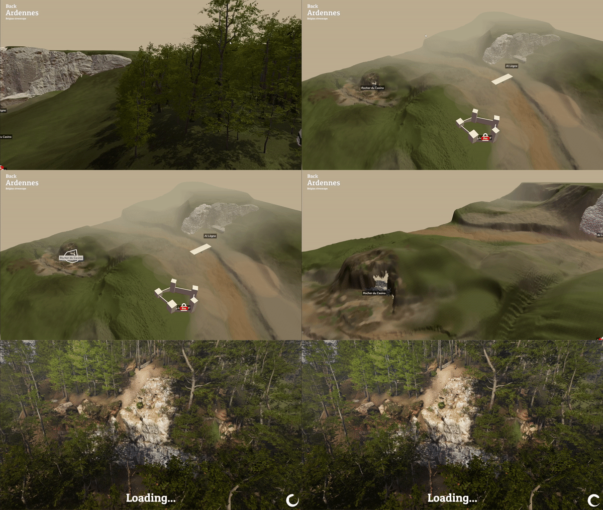
Working with 2D images and drawing lines on top of that was a pain to make work for different aspect ratios. I also prefer 3D menus that immediately immerse you in the game. So I switched to a 3D rendered view of the locations with animated cameras as transitions.

After selecting a location the actual gameplay scene for that location loads. From here you select a section and after that you select a route to climb. The routes are drawn in 3D with a LineRenderer and can be selected right from the section overview. Switching between gameplay and route selection is seamless, as long as you stay at the selected location.

Later on we also added a fast-travel menu to instantly travel to any location or area in the game.

If given more time and art resources I would’ve made the onboarding of new players more interesting by adding a proper introduction to the game. I would’ve also made the visual style of the UI more like actual climbing guides with a more paper-like look. But given our limited resources we settled on a simpler modern/clean visual design.
Creating the Boulderhall Tutorial Level
New Heights needed a tutorial level and while we had the gameplay element of the tutorial done pretty early (for testing purposes) we did not have a proper level around it. So I took it upon myself to design and develop a level around our tutorial climbing walls. I started out by creating a simple overview of the level which I then blocked out in Unity.
We had already settled on a visual style: It would be an outdoor boulder area with an industrial look. We took some assets from the Unity Asset Store and gave the level its basic look which can be seen below.

After the first blockout and asset placement I updated the level with the help of a colleague to get a different view and input on it. We settled on a weather style and tweaked some of the climbing wall placements, replaced some with climbing blocks instead of walls and we tweaked the layout a bit more.
We were satisfied with the layout and flow of the level but graphically it needed to be on-par with the rest of the game which was photoscanned. It did not stand up against the other levels we have in the game. This was problematic for us because the boulder gym is the players’ first impression and is also something you see when you watch someone play the game for the first time.
First I tackled the climbing walls. These were just simple shapes made with ProBuilder and had a diffuse texture slapped on them. I made new wall models in Blender and made new textures myself. I took my camera to the local bouldering hall, made a lot of photos of the walls and holds and made them tile properly using Photoshop.
To create a more photorealistic and modern look the textures needed to fit into the PBR pipeline. I came across a program called Materialize. This program takes a photo as input and with it you can create all the needed texture maps for a full PBR material.

With the texture workflow in place the climbing holds were also updated using Materialize. I had also taken several high resolution photos of climbing holds in our local boulder gym which I converted to PBR materials.

We also added more props around the level, updated the ground texture and the texture for the mats.
The end result is a way more realistic looking boulder gym that looks like it has actual climbing going on. The graphics are also more in line with the rest of the game regarding fidelity and level of detail.
